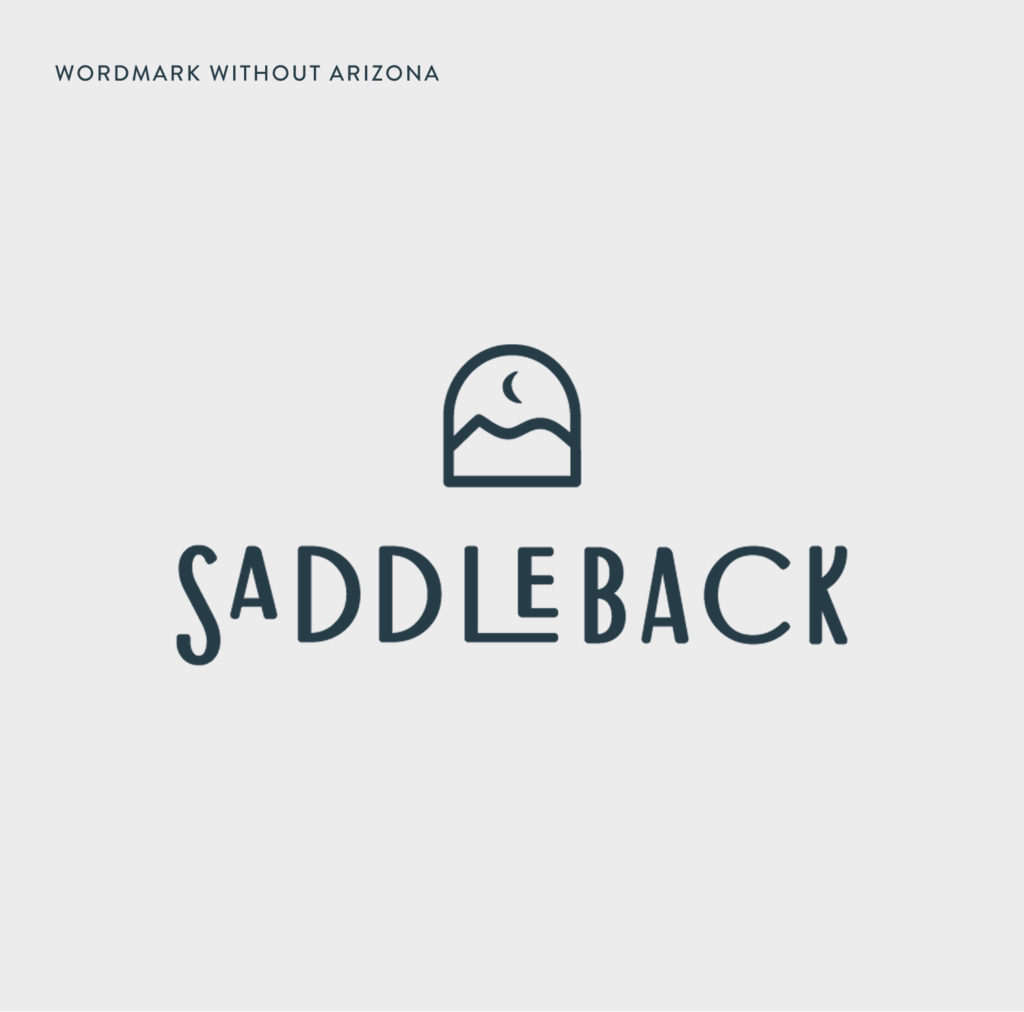
Midnight Blue, Poppy and Black or KO versions of the primary Saddleback logo are provided for more flexible use over other brand colors and photography. The primary logo consists of a the wordmark, support mark and incorporation of “Arizona.”
Select a background
Primary – KO Over Image
Brand System
The Saddleback identity includes support marks.
The support marks can function as versatile standalone graphic elements. They should generally be used in applications/contexts where the Saddleback brand is already established or understood.
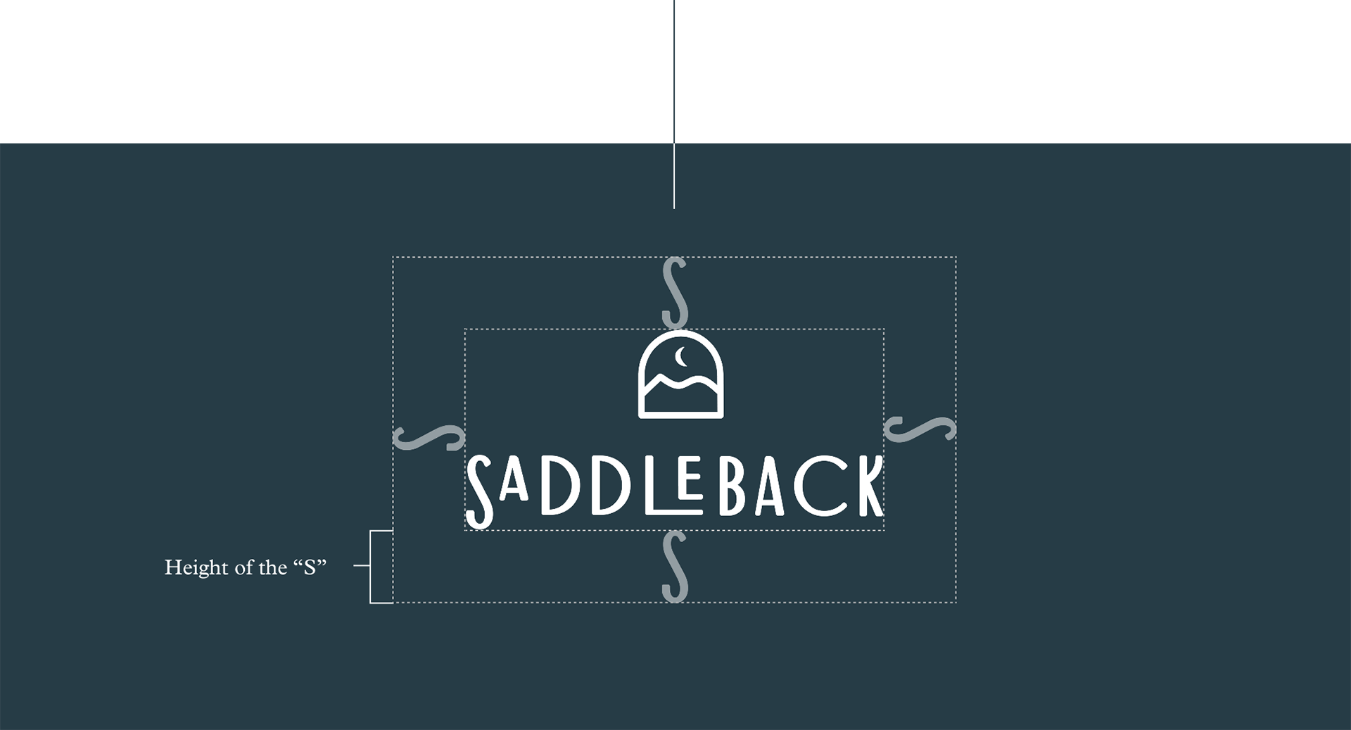
clear space
Give our logo room to breathe. Keep a clear space around it so it always feels clean and uncluttered—free from text, photos, or busy backgrounds. As a rule, the clear space should be at least the height of the “S” in our logo mark.
minimum size
Our logo should always be easy to read and recognize. That’s why we have a minimum size—so the details and colors stay crisp.
Never use the Saddleback logo smaller than 1.5 inches or 200 pixels wide, no matter the format.
logo usage
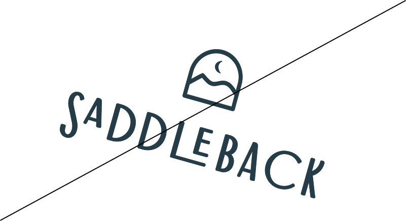
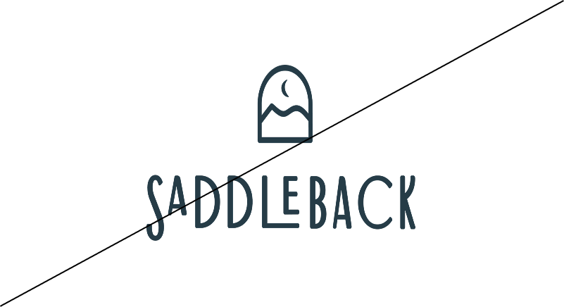
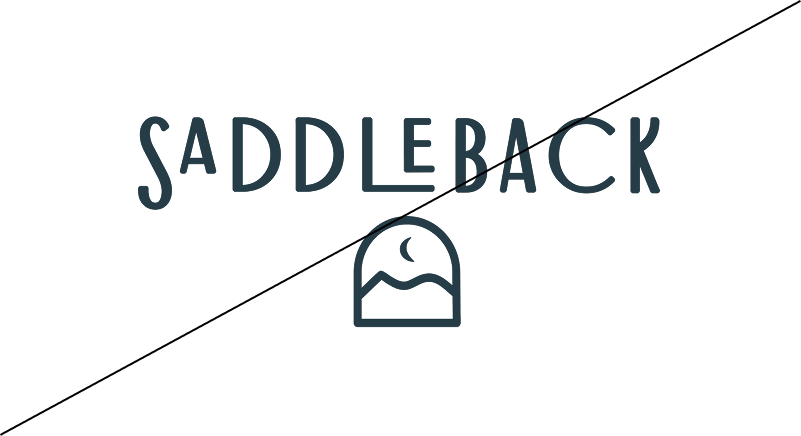
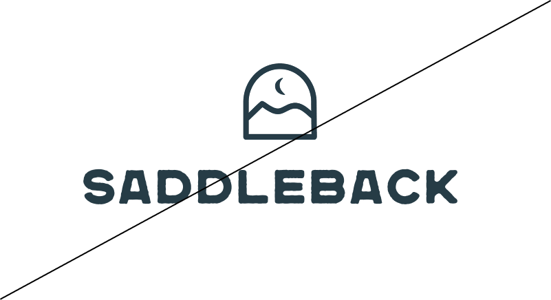
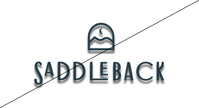
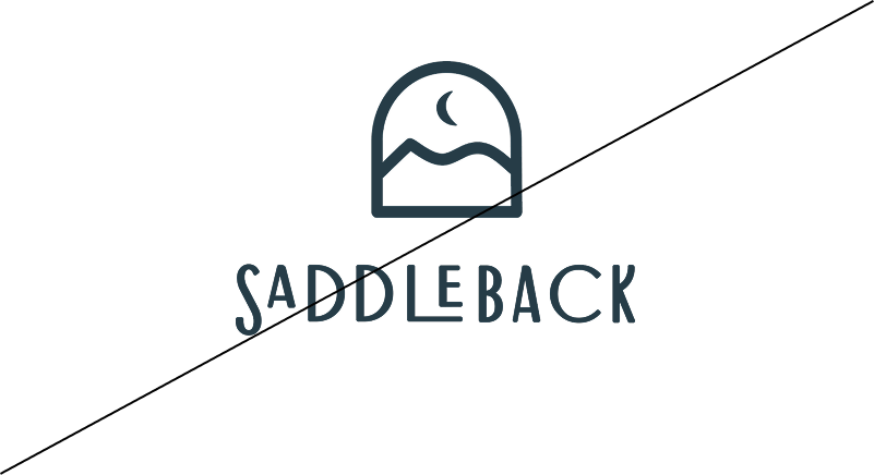
A logo used incorrectly can diminish the integrity of the brand. The following uses are not allowed:
Do not rotate
Do not use colors outside the brand palette
Do not distort
Do not rearrange
Do not use other typefaces
Do not apply drop shadows or other effects
Do not alter proportions of logo elements
Do not outline or add stroke
Do not use brand colors other than the provided files
For any questions about using the Brand Standards for Saddleback, please contact The James Agency at 480.420.6710 or creative@thejamesagency.com.